SleepQ
A Smart Diffuser Paired with an Application

Problem
“35% of Americans don’t get enough sleep (7 hours per day) according to the CDC.” A good night’s sleep can make or break a good day, and a pattern of poor sleep can lead to serious health issues.
Goal
This project's goal is to design a sleep aid that pairs with a mobile app to help someone get a better night’s rest.
The Process
We completed this project through the Human-centered Design Thinking process.
-
General Research
-
Competitive Analysis
-
Interview
-
Empathy Map
-
Problem Statement
-
User Personas
-
HMW
-
Crazy 6's
-
User Journey
-
IA
-
User Flow
-
Wireframe
-
Branding
-
Mock-up
-
Prototype
-
Usability Test
-
Metrics
-
Qualitative and Quantitative Tests
-
Benchmark
-
User feedback
-
-
Finding & Revisions
Duration: 8 weeks
Role: Researcher and UX/UI Designer
Tools: Figma, Miro, Tinkercad, Google Docs
A. General Research
A series of research was conducted by team members to answer the following questions:
-
Why people can't fall asleep?
-
Why do people wake up during the night or set an ideal sleep schedule?
-
Effects of poor sleep patterns?
-
What helps people fall asleep?
-
Effects of existing technologies on sleep patterns?
The outcomes of the research had an important role in having a wide perspective about the problem and keeping the team on track.
B. Competitive Research
There are some applications and devices in the market that help users to have a high quality sleep. The features of these products were compared and analyzed to find best ways to improve users' sleep.

C. Interview
The results of the first round of research raised up some assumptions for the team, and to clarify those thoughts the possible users were interviewed.
D. Empathy Map
Based on the interviews three Empathy Maps were created to visualize user attitudes and behaviours. This helped the team align on a deep understanding of end users and discover the pain points of lack of sleep and deeply understand the problem.
A. Problem Statement
The user interviews helped the team to formulate a concise description of the user's sleep problems.
"Professionals with busy stressful lives need an aid that helps train them to build a better sleep habit because their unstable routine is affecting their professional life".
B. User Personas
Three versions of the user persona were generated to have a realistic view of the end-users and their needs. Using a mixed approach of qualitative and quantitative methods in collecting and validating the data of end users is the best practice for creating a persona. We used only the qualitative method through brainstorming and sharing our opinions and observations. We knew that the generated personas were not representative and there was the risk of inaccuracy and subjectivity. However, based on the project scope, we used qualitative methods to find out users' shared mental models.
A. HMW
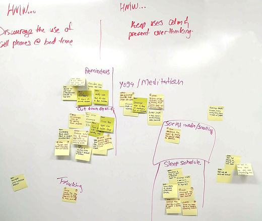
The team set several meetings in the ideation part and brainstorming to achieve unique and practical solutions. In this state, the team concluded that the product should have features like scheduling, reminder, relaxing methods, sleep tracking, and aromatherapy.

B. Crazy 6's
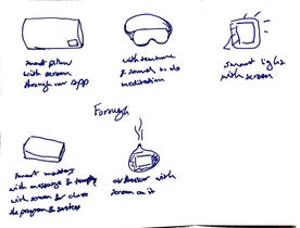
Using crazy 6's ideation method, the team had the chance to get new ideas about a device. In this phase, the team decided to produce a smart diffuser that pairs with an application.
C. User Journey
The team needed to understand users' behaviour and feelings over their journey to find opportunities linked to the UX design decisions.
The user's journey was defined in 5 main steps:
-
Awareness
-
Research/Consideration
-
Decision
-
Delivery & Use
-
Loyalty & Advocacy
User Journey helped the team to understand significant gaps connected to the user experience, such as the user's need for tutorials.
D. Information Architecture
Two information architectures were generated for both the application and the device.
E. User Flow
A user flow that demonstrated a user's experience, using the application and device, was created.
F. Wireframe (Low & Medium-fidelity)
Wireframes for the application were generated in two versions: low and medium fidelity.


A. Branding
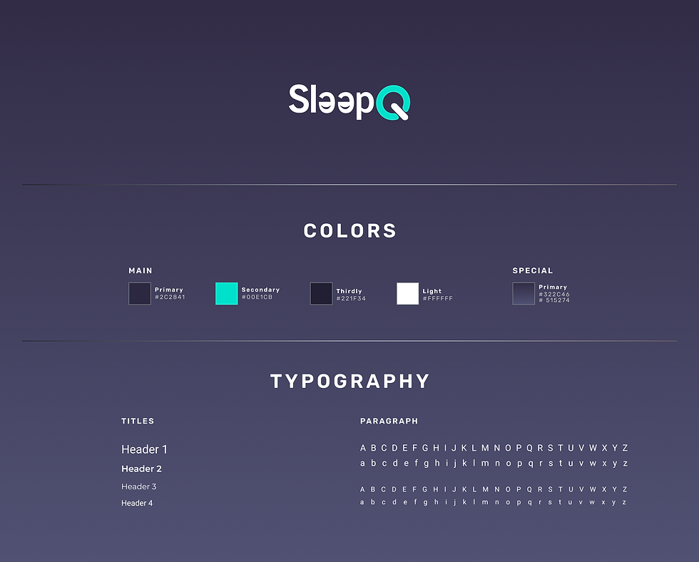
SleepQ's logo was created with two main features: backward to show closed eyes and Q that is designed like a turn on-turn off icon to show the nature of sleep.
For the colour palette, three colours including teal, and two dark bluish grays were selected.
Two fonts were used: Montserrat and Roboto, which are easy to read on a dark background.


B. Mock-up
Device
Using the Tinkercad application a mockup version of the smart diffuser was created. The diffuser was easy to refill, able to play music

Application
In high fidelity mockup, the team decided to simplify the wireframes and eliminated two icons from the navigation bar. Since people might use SleepQ at night, the application was designed in dark mode by default. However, the user can change the mood to light.

C. Prototype
Using Figma an interactive version of the application was created to demonstrate the application's interactive and UI features.

Usability test
Five people were asked to complete four tasks including:
1- Find the meditation tab and schedule the meditation exercise
2- Can you cancel Yoga exercise from your daily routine?
3- Explore yearly stats for yoga
4- Your app is reminding you to fill the diffuser with oil. You fill that and want to insert filling data in the application. Where will you go?
Metrics
-
Task completion rate (%)
-
Time on task (seconds)
-
Satisfaction evaluation (rate from 1-5)
-
Observation
Qualitative and Quantitative Tests
To test the usability of our design, we conducted a qualitative, as well as quantitative test. The qualitative test included observing users' reactions during the session and interviewing them after completing the task. For the quantitative part, statistics such as task completion rate (%), time on task (seconds), and user satisfaction scores were collected.
Benchmark
For the quantitative test, we needed a benchmark to compare our results with that. In general, there are several ways to access a benchmark:
1- Publicly available benchmarks for similar tasks
2- The product's current log files, which can be used as a benchmark for modified versions of the products.
We didn't have access to any benchmark for this project. We familiarized two users with the application's navigation and asked them to do the test the next day. By this, we were able to know the best result that could be achieved. We tracked time on tasks and averaged them to find the golden standard to complete tasks and compared the results with our generated benchmarks.
User Feedback
Users had some suggestions for the application that were applied in the prototype.


Findings & Revisions
All tasks were done successfully by participants. Task 1 took a bit more time to complete. Based on the participants' feedback, they felt confused in finding the Meditation tab. Participants expressed they were not sure that Meditation was inside the Relaxation menu. We have anticipated this issue. Since the Relaxation menu includes three tabs: Meditation, Breathing, and Yoga, the best copy we could choose was Relaxation. The team decided to keep this copy and let users learn about that by trial and error.
Participants also were confused about the bottom icons on navigation bar, they thought the icon for My Routine was to set the alarm or stopwatch, so they suggested adding a title under each icon on the nav bar to avoid misunderstanding.

Emotional rating
We wanted to help users find their most successful sleep patterns. To achieve this goal we needed a way to collect quantitative data on users' sleep quality. We addressed this through Emotional Ratings, asking users to evaluate their sleep in the morning. The application algorithm links this data to the Stats (duration of each sleep/practice (yoga, meditation, breathing) and informs the users which pattern results in good sleep.

In this project, we discovered an obstacle in the first stages; Research showed for good sleep, using a mobile device should stop at least two hours before bedtime. We considered that users should put aside the application two hours before falling asleep. To address this challenge, we add scheduling features to the product.
Lessons Learned
For future projects we will consider the following points:
-
Focusing more on Information Architecture, and using the card-sorting method to define the navigation of the application.
-
Testing Information Architecture by potential users
-
Conducting the usability test at the first steps of the prototyping


